Broadpin

From Numbers to Decisions: Why easy analytics and visual KPIs are a real advantage in Oracle HCM Cloud

This blog post was written by Katharina Seidenfuss.

HR holds more of the information a business needs for its decisions than almost any other department. It knows the headcount, who is joining and leaving, what people cost, how engaged they are and where the risks sit. Most of that information never reaches an actual decision, though. It stays in tables that nobody has the time to read. The real value of Oracle HCM Cloud is not simply that it stores all of this. It is that building an analysis from the data takes a few minutes rather than a whole IT project, and turning that analysis into a picture a manager can act on takes one more click.

This blog looks at why the reporting in Oracle HCM Cloud is such a practical advantage, because HR teams can build their own analyses quickly instead of waiting for someone else to do it. It explains which tools in the system make an analysis so easy to put together, why showing a KPI as a chart rather than a list changes the decisions people make, and which figures in HR have the greatest effect on the business the moment you make them visible.
The Reporting Advantage Hiding in Plain Sight

In many older HR systems, getting a report is a small project in itself. The data sits in one place and the reporting tools in another, and anything that is not a standard report means pulling an extract, working it in a spreadsheet and then waiting. By the time the numbers are ready, the question has often already moved on. A finding that arrives three weeks late is not really a finding at all. It is history.

Oracle HCM Cloud changes this completely. Because the reporting runs directly on the same live data as the application, an HR analyst can answer a question in the time it used to take just to raise the request. There is no data warehouse to load first and no need to go back to IT for every new view. That change, from asking for a report to building the answer yourself, is where the value for the business begins.

Why Building an Analysis Is So Easy

Oracle HCM Cloud gives HR and the wider business several reporting tools that work together, so each question can be answered with the tool that suits it best, rather than forcing everything through a single one.

  • OTBI (Oracle Transactional Business Intelligence) is the tool most people reach for day to day. It reports on live data through subject areas that are already built for you, covering worker assignments, absences, learning, payroll, recruiting and more. You drag the columns you want onto the canvas, add a filter or two, and move between a table, a pivot, a bar chart or a gauge without writing any code.

  • BI Publisher takes care of precisely formatted output such as payslips, letters and statutory documents, and it can send them out automatically on a schedule.

  • Infolets and dashboards place the most important figures right on the home page, so people see the number that matters the moment they log in, rather than only when they go looking for it.

  • Oracle Fusion HCM Analytics adds a further layer with an analytics warehouse that is already built. It provides historical trends, KPIs that span several areas of the business and metrics that come ready to use, which suits the deeper, cross-functional questions asked at board level.

Two things make this genuinely easy, and not merely possible. First, the subject areas come ready to use, so an analyst can spend the time on the question itself rather than on setting up the joins behind it. Second, every analysis follows the same HCM data security rules as the application. A line manager who builds a view still sees only their own team, and a country HR lead sees only their own country. You do not have to choose between letting people build their own reports and keeping the data properly protected. You get both.

A Number Is Not an Insight

This is the part that many reporting projects miss. Producing the number is only half the work. A KPI shown as a column of figures asks the reader to do the analysis in their own head, to notice the trend, judge how serious it is and decide whether it deserves attention. Most managers are too busy to do that, and so the message is lost. Put the same figures on a chart and the point becomes impossible to overlook. The chart does the interpreting for you.

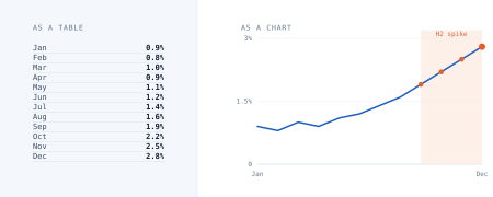
The example below shows the same twelve months of voluntary turnover in two ways. On the left it appears as a table, and on the right as a chart.

Fig. 1: Illustrative data. Voluntary turnover by month.

It is the same twelve numbers either way. In the table the trend is buried, while in the chart the sharp rise in the second half of the year is obvious within a second. That second is the difference between noticing a turnover problem in September and only discovering it in the review at the end of the year.

Nothing changed except the format. Yet the version on the right makes you ask what happened after the summer, while the version on the left invites little more than a polite nod. Repeat that difference across every figure a leadership team reviews, and you have every reason to show data as pictures rather than as lists.

The KPIs Worth Making Visible

Not every figure deserves a place on a dashboard. The ones that do have something in common. They change over time or across the organization, and a manager can actually act on them when they move. Here are three that consistently earn their place. Each one is straightforward to build in OTBI, and each says far more as a picture than as a single figure.

Time to Hire (Talent Acquisition)

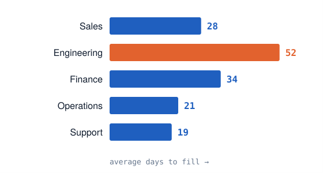
One team is pulling the average up. The answer is to fix the hiring pipeline in Engineering, rather than to change the hiring process for the whole company.

Gender Pay Gap (Pay Equity and ESG)

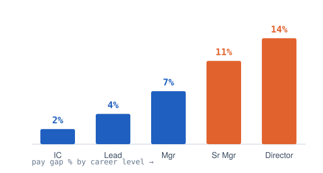
The gap grows wider the more senior the role. That points to a problem with how people are promoted, rather than with the salaries they are offered when they join.

Absence Rate (Workforce Health)

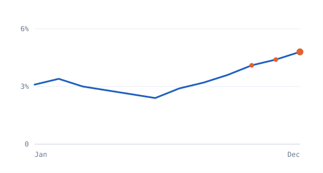
A rise toward the end of the year is an early warning of burnout. It appears while there is still time to do something about it.

Each of these was built with a few columns and a filter. Their value does not come from being technically clever. It comes from turning a vague worry, such as whether the company is losing people, whether its pay is fair, or whether a team is stretched too thin, into a clear question that someone can see and take ownership of. Because they run on live data, they stay up to date by themselves, and there is no report to rebuild every month.

It is worth noting how closely some of these connect to wider obligations. A view of the gender pay gap is not only a question of fairness. It is exactly the kind of social data, the S in ESG, that reporting under the CSRD will expect large employers to produce. Preparing the analysis for internal use and having it ready to disclose are, more and more, the same piece of work.

From Dashboard to Decision: The Business Impact

The point of all this is not to produce prettier reports. It is to help more people make faster and better decisions. When a KPI is easy to build and easy to read, three things tend to happen. Problems come to light earlier, while they are still cheap to fix. A rise in turnover spotted in the third quarter costs far less to address than the same rise discovered only at the end of the year. Decisions also move closer to the work, because a manager who can see the numbers for their own team does not have to wait for a central report before acting. And discussions start from a picture everyone shares, rather than from competing spreadsheets, which is where a great deal of the time spent on reporting is usually lost.

This is what good reporting adds up to when people can run it themselves. It is not one better report, but a whole organization that notices things sooner.

How to Get Started

The point of all this is not to produce prettier reports. It is to help more people make faster and better decisions. When a KPI is easy to build and easy to read, three things tend to happen. Problems come to light earlier, while they are still cheap to fix. A rise in turnover spotted in the third quarter costs far less to address than the same rise discovered only at the end of the year. Decisions also move closer to the work, because a manager who can see the numbers for their own team does not have to wait for a central report before acting. And discussions start from a picture everyone shares, rather than from competing spreadsheets, which is where a great deal of the time spent on reporting is usually lost.

This is what good reporting adds up to when people can run it themselves. It is not one better report, but a whole organization that notices things sooner.

How to Get Started

You do not need a big project to get going. The approaches that work best start small and show their worth quickly.

1

Start with the questions that keep the leadership awake at night.

Begin with the decisions rather than the data. Three or four genuine questions, about retention, how quickly you hire, whether pay is fair and how much people are absent, will lead you straight to the figures worth building first.

2

Build the first analyses in OTBI.

Use the subject areas that are already provided to answer those questions directly on live data. Aim to have working views within days, rather than a modeling exercise that runs for months.

3

Choose the right chart for each KPI.

Trends are best shown as lines, comparisons as bars, and the way parts add up to a whole as a stacked or donut chart. The type of chart is part of the message, so choose the one that makes the point obvious.

4

Put them where people already work.

Move the best views onto infolets and dashboards on the home page, and let the HCM data security decide who sees what. The figure should reach the manager, rather than the manager having to go and find it.

5

Grow into deeper analysis over time.

Once building your own reports has become part of the routine, move on to Oracle Fusion HCM Analytics for historical trends and for KPIs that span several areas and support reporting at board level and for ESG.

Ready to Get Started?

Good HR reporting is not about buying yet another tool, because everything you need is already in your Oracle HCM Cloud. It is about knowing which questions to ask, building the analyses that answer them, and presenting the figures so that the point cannot be missed. That is where the real business impact comes from. If you would like to see what your current Oracle HCM Cloud can show you, and turn the data you already hold into dashboards your leaders will actually use, talk to the Broadpin HCM team. We have built these analyses across many industries and can help you move from numbers to decisions with confidence.